Warning: Graphic Imagery
Graphic Design—Now in Production
Contemporary Arts Museum
July 20–Sept 29. Free. 5216 Montrose Blvd. 713-284-8250. camh.org
Last year, the University of California decided that its dignified 144-year-old seal, featuring an open book and the motto “Let There Be Light,” was a just a little too dignified. To replace it, an in-house design team created a monogram featuring a yellow “C” inside a blue “U.” When the public got a look at the new logo, which would have appeared on all UC websites and publicity materials, the backlash was swift and unmerciful. Many thought the design resembled a flushing toilet; others, a banana sticker. After weeks of criticism, UC decided to kill the logo.

Starbucks’ old logo—and Starbucks’ new logo.
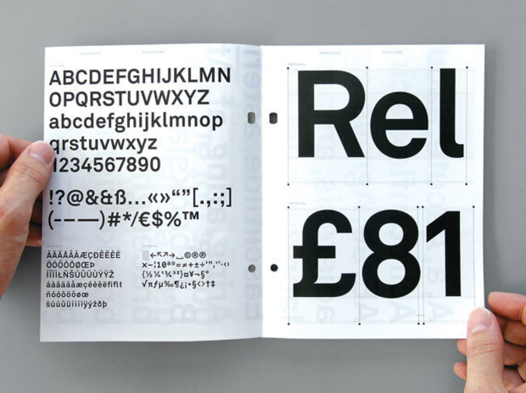
Once a niche interest, graphic design now attracts major attention, which curator Ellen Lupton of the Smithsonian’s Cooper-Hewitt National Design Museum in New York attributes to the widespread availability of design software like Photoshop. “The technology revolution has just opened up interest in practicing design, even if it’s just people playing around with fonts in their PowerPoint presentations,” Lupton says. “Thirty years ago, you couldn’t really imagine people caring about a logo or a typeface.” The new Contemporary Arts Museum exhibition Graphic Design—Now in Production, which was co-organized by Cooper-Hewitt and the Walker Art Center in Minneapolis, features a section comparing the old and new logos of companies like Starbucks, Comedy Central, and the Library of Congress. Visitors can vote on whether they prefer the before or after version.
One of the artists featured in the exhibition is Trevor Paglen, who works with a different kind of logo—the patches top-secret military units known as “black programs” put on their uniforms. Paglen has been collecting these patches, which often feature arcane imagery, over the last few years. “If you’re an insider you can read what the symbols mean,” Paglen says. “But if you’re an outsider they tend to be quite opaque.” One of the patches in the exhibition says “Red Hats” at the top and “More With Less” at the bottom. In the middle of the patch are six stars and an image of a bear crawling over the globe. What does it mean? “I could tell you, but then you would have to be destroyed,” Paglen says, laughing.
Actually, of course, you just have to see the show.


