'Stro Style: Reflecting on 53 Years of Uniforms
Look, we know this is silly. Baseball uniforms are baseball uniforms, and they will never not resemble pajamas on some level. That being said, few major league teams can rival the legacy of sartorial innovation exhibited over the years by our Houston Astros.
Astros jerseys have been a lot of things, but they’ve rarely been boring. In a landscape crammed with dull road grays and countless pinstripes, that’s saying something. So in that spirit, and in honor of MLB Opening Day, here’s our look at the best—and the worst—jerseys throughout Astros history.
Before we dive in, a note: Major League Baseball came to Houston in 1962 in the form of a National League expansion team called the Colt .45s. That didn’t work out too well—the Colts fizzled their way through three consecutive 96-loss seasons, ultimately proving to be so bad that they had to change their name out of sheer humiliation. No strangers to the secret of a successful makeover, the Colts went big, fully embracing the cultural moment and helping themselves to a dose of optimism bright enough to wash away the embarrassment of the previous three years. Their new identity? The Houston Astros, intergalactic pioneers whose pitchers threw laser beams into the catcher’s mitt and whose hitters could launch a ball into low orbit. They played their first game in the Astrodome mere weeks after Gus Grissom and John Young circled the earth three times in the first manned Gemini flight. Even in 1965, the Astros were the baseball team of the future. This is where our jersey journey begins.
The Shooting Star, 1965-1974
Elegant in their simplicity, the first unis donned by the Astros still rank among the finest. The road look should be familiar to present-day fans—as should the navy cap with a white H over an orange star. The color scheme switched in 1971, with orange taking over as the primary color and navy flipping into the complement. But the idea was the same, and the result just as striking.
The team logo throughout these years featured baseballs in orbit around the Astrodome, and was worn as a patch on the jersey sleeve.
Here’s Hall of Famer Joe Morgan in 1967, fully aware that he’s looking good:
The Rainbow, 1975-1986
One of the most iconic looks in jersey history, and rightly so. These beauties were brought to life by a subcontracted graphic designer who cut out strips of colored paper by hand and lovingly arranged them into the pattern Astros fans know and love today. Jack Amuny was the man wielding the scissors, and though he’s modest about his place in fashion history (“I guess I was in my stripe period”), we know genius when we see it.
Don’t listen to what those out-of-towners say—these are the greatest uniforms in baseball history, even when they stuck the jersey number on the right thigh.
Here, J.R. Richard and Nolan Ryan ponder their future in modeling:
Rainbow Shoulders, 1980-1993
Starting life as a home alternate to the full-rainbow jerseys, this design took the reins full-time in 1987. It’s not nearly as fun as its predecessor, but it still earns points for color and style—especially considering what was to come. An inoffensive, middle-of-the-pack uniform.
Nolan Ryan models the rainbow shoulder jersey pitching a game against Atlanta in 1983. The Astros won, 4-3.
Image: Wahkeenah/Wikimedia Commons
The Open Star, 1994-1999
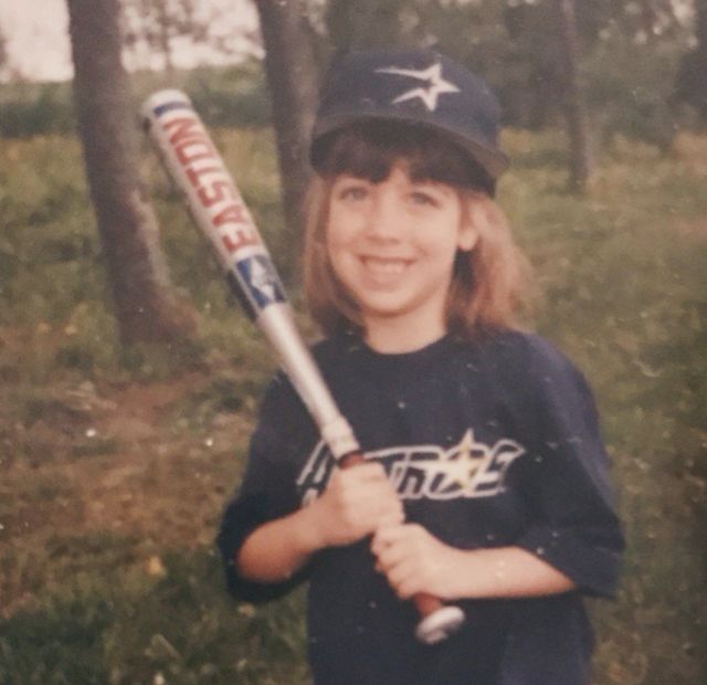
Editor's note: I dare say I pulled off the dreaded open star with aplomb during my days as a child T-ball star in the '90s.
Image: Abby Ledoux
The ‘Stros sold their team in 1993, and celebrated by sucking the life out of their uniforms. Gone are the bright colors and bold designs of yesteryear. In their place, a funky unfinished star thing, a goofy “futuristic” font, and a dull palette of blue and silver.
These are bad, but there’s still something to be said for nostalgia. Biggio and Bagwell were at the height of their powers during this era, even if they looked like doofuses.
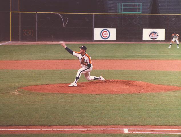
The Millennial Identity Crisis, 2000-2012
The ‘Stros left the Astrodome in 2000 for greener pastures. Naming their new stadium “Enron Field,” in retrospect, was a mistake. So were these overhauled jerseys, which were commissioned to commemorate the occasion.
The open star motif stuck around, but the color palette switched to rust-red and black. Meanwhile, the team ditched their sci-fi font (good!) for a weird, ropy cursive (bad). The Astros made it to their first World Series in these uniforms, but that’s their only redeeming feature.

Sensing a photographer, Carlos Lee goes incognito with a pair of shades.
The Comeback Kids, 2013-Present
These were cool when they debuted in 2013, heralding the ‘Stros’ move to the American League while nodding to past designs. They’re clean, they’re classic, and the orange piping adds a subtle flair. They became even cooler when the Astros wore these threads throughout their dominant World Series championship season last year. They’ll never match the rainbow for sheer charisma, but this design is now iconic in its own right.

Just ask this guy how much he likes putting on this jersey.
Image: Keeton Gale/Shutterstock.com


